Hey friends. I’m back with another easy-peasy tutorial for you all, this time on making something have a neon outline in Photoshop (yay!). I found this technique especially helpful for my Space Cowgirl cubist piece; I took a lot of inspiration from the vaporwave/90s Miami aesthetic, so I needed a way to do basic neon effects without taking up too much time. Experiment with it and see what you come up with!
***BEFORE YOU START: Make sure your document is the correct size, resolution, and color profile. Nothing worse than having to redo that after you’ve already made progress!
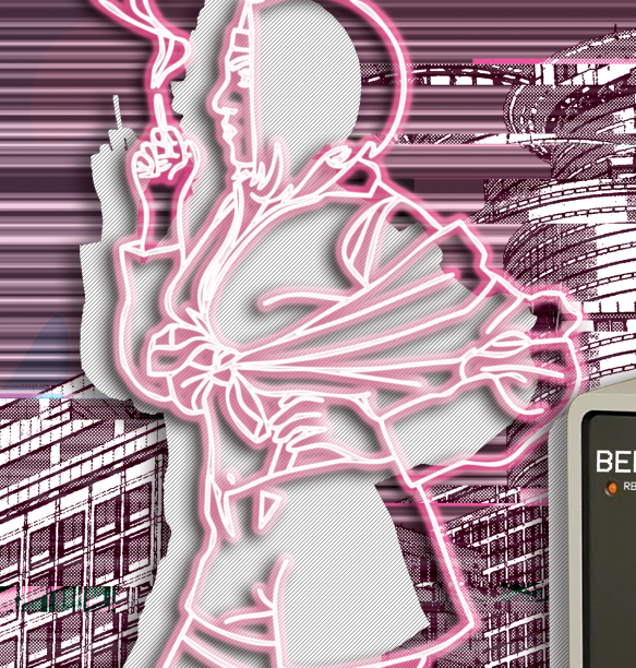
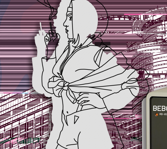
Starting image: You can see my original line work (imported from Procreate) towards the right, and a pattern fill silhouette layer I’m going to be laying my neon lines over on the left. I’m working on an 18x22in document with 150dpi.
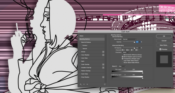
1. Duplicate your line work layer. Make sure that layer is selected, then go to your blending effects option by right clicking on your layer and selecting “blending effects”. There will be several things to apply here.
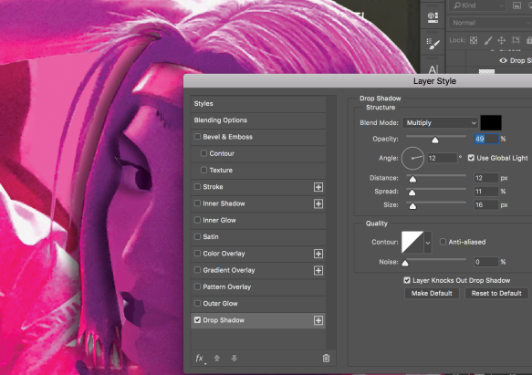
2. (Click through slideshow) First, add your outer glow. I set mine to several parameters, as you can see below. Feel free to experiment with this on your own to achieve your desired effect! Next, add an inner glow. For a linear piece I don’t find it to be particularly spectacular but it’s definitely good when working with a regular image, so I’d still say add it. Finally, add a color overlay. I would make the color of it something between your original color and white, because we’ll be adding actual white to give it that bright neon effect in the next few steps. I also decided to add a drop shadow because it helped to differentiate it from my background a bit more.
This slideshow requires JavaScript.
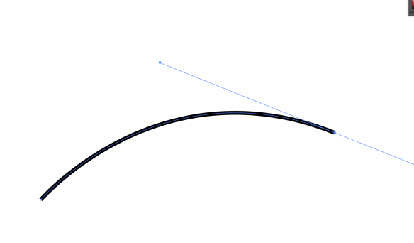
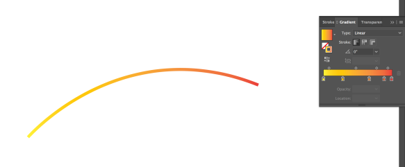
3. (Click through slideshow) Next, take the duplicate of your original line layer and select it by clicking on the layer preview while pressing command (MAC) or CTRL (PC). Delete the lines, then click on Paths in the layer panel and create a work path. It will look like a bunch of lines drawn over your photo. Then stroke the path with the brush of your choosing; you can see the parameters of the one I chose in my photo, but do make sure the color you use for this is white. The softer the brush the more realistic this will look!
This slideshow requires JavaScript.
4. This is your final result! Feel free to play with your layers as you see fit, and let me know if you have any questions! 🙂 I decided to duplicate my colored neon layers to make it slightly more opaque, but you are free to do whatever you want.